
Course Overview
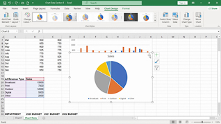
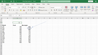
Visualizing data makes it easier to identify trends and communicate insights, which is why charts remain one of Excel’s most widely used features (Microsoft; GoSkills). This course teaches you how to create charts and insert graphics that make your spreadsheets more engaging and easier to understand.
You will learn how to present data visually, highlight key information, and build reports that are both professional and easy to interpret.
The result of this course is simple: clearer communication and more impactful spreadsheets.


Key Audience
The course is intended for anyone who wants to present spreadsheet data more effectively in Excel 365.
Course Topics
Creating Charts
Inserting Graphics
Course Detail
Course ID
bbrnmebe5_vod
Time
9-10 MIN
Questions
1
Languages
en
video format
HD
captions
No
Resources
Yes
Lessons
2
Remediation
Yes
Bookmarking
Yes
Feedback
No
Microlearning
No