Course Overview
This online training course introduces Office 365 users to creating charts, tables, and PivotTables in Microsoft Excel 365. Users taking this course will learn how to organize and present data more effectively using Excel’s built-in tracking and reporting tools.
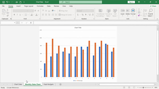
Throughout the course, learners see how to create and modify different chart types to display information clearly and professionally. The training also explains how to update chart source data, customize chart elements, and format tables for improved organization and readability. In addition, employees learn how to create PivotTables to quickly summarize, analyze, and interpret larger amounts of data.
By the end of the course, learners will have a better understanding of Excel 365’s charting and data analysis features and how to use them to create clear and accurate spreadsheets for everyday use.


Key Audience
Microsoft Office 365 Users
Course Topics
Changing Chart Types
Changing Chart Source Data
Creating A Table
Creating A PivotTable
Course Detail
Course ID
bbrnmeba4_vod
Time
24-27 MIN
Questions
3
Languages
en
video format
HD
captions
No
Resources
Yes
Lessons
4
Remediation
Yes
Bookmarking
Yes
Feedback
No
Microlearning
No