
Course Overview
Visual data is easier to understand and act on than rows of numbers alone, making charts one of Excel’s most valuable reporting tools (Microsoft; Gartner). This course teaches you how to create polished, professional visualizations via Excel 365 charts and graphics.
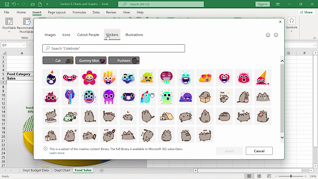
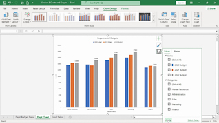
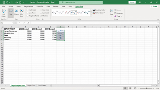
The course shows users how to utilize chart elements, chart formatting, sparklines, graphics, and SmartArt. You will learn how to present trends clearly, highlight key insights, and build reports that communicate information at a glance.
The result of this Microsoft Excel 365 training course is simple: more compelling spreadsheets and better business communication.

Key Audience
The course is intended for anyone who wants to create more effective data visualizations in Excel 365.
Course Topics
Chart Elements
Chart Formats
Sparklines
Graphics
SmartArt
Course Detail
Course ID
bbrnmein5_vod
Time
27-30 MIN
Questions
3
Languages
en
video format
HD
captions
No
Resources
Yes
Lessons
5
Remediation
Yes
Bookmarking
Yes
Feedback
No
Microlearning
No