Course Overview
This training course helps new and experienced Excel users create attractive charts, enabling people to visualize the data contained in an Excel spreadsheet. The course provides step-by-step instructions for creating charts based on data sets. The trainer shows which chart type to use to display certain types of data. Viewers also learn how to modify and format charts to maximize readability. The utility of applying chart styles for quick and easy formatting is detailed. Excel 2016 has simplified creating charts and this video shows viewers how to use the program’s tools to create a visually appealing display, making data more meaningful and attractive.

Key Audience
New and experienced Excel users
Course Topics
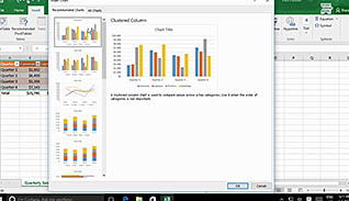
Create Charts
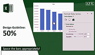
Modify and Format Charts
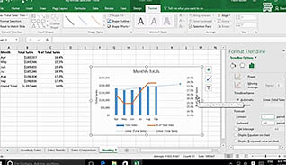
Use Advanced Chart Features
Create a Dual-Axis Chart
Create a Chart Template
Visualizing Data with Charts - Best Practices
Course Detail
Course ID
sonie16vd_vod
Time
23-32 MIN
Questions
9
Languages
en
video format
HD
captions
Yes
Resources
Yes
Lessons
6
Remediation
Yes
Bookmarking
Yes
Feedback
Yes
Microlearning