Course Overview
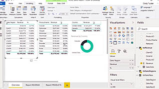
By using Power BI you can present data via interactive visualizations such as tables, charts and graphs in an appealing and useful fashion. With Power BI, you can combine information from multiple sources and create a more complete picture of what you are analyzing. This, in turn, allows you to make better, and more educated, business decisions. In this training video, which is one in a series of videos, you will learn how to optimize your Power BI reports to improve their readability. The more accurate, readable, and easily understood your reports are, the more meaningful they become. And the more meaningful your reports, the better your company’s decisions will be. You can ensure your reports are optimized via multiple methods in Power BI, including field properties, reference lines, radial gauges, and text boxes, all of which you learn about here. This course also provides information regarding how you can optimize your reports for your mobile device. By utilizing the methods presented here, you can create visually impactful reports on all of your business data.
Key Audience
Course Topics
Course Detail
Time
Languages
video format
captions
Resources
Lessons
Remediation
Bookmarking
Feedback
Microlearning


